Case Study - Transit Planner Redesign
Handed offDisclaimer: Due to non-discolosure agreements, I am limited in the amount of work I can show.
Background
Transit Planner is a tailored design for commuters who potentially will be using online multimodal trip plan services commute to work or school, which can be added or removed on RideShark’s SaaS application. RideShark is a commute management SaaS platform where an organization or institution can operate and observe information about their employees’ or students’ commutes and activities.
RideShark wanted to make the transit planner grow steadily by offering better transit solutions, the first phase was to redesign.
Spent Time
60 days
Role
Solo UI/UX designer
Years
2022
Business Needs
The old version was outdated, also want to increase the user activities, encourage everyone travel by using public transit mode. Rideshark needs to provide a better transit trip solution for the commuters who might be looking for.
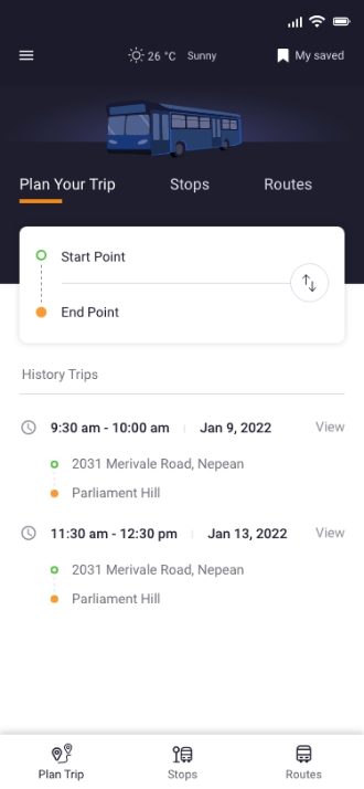
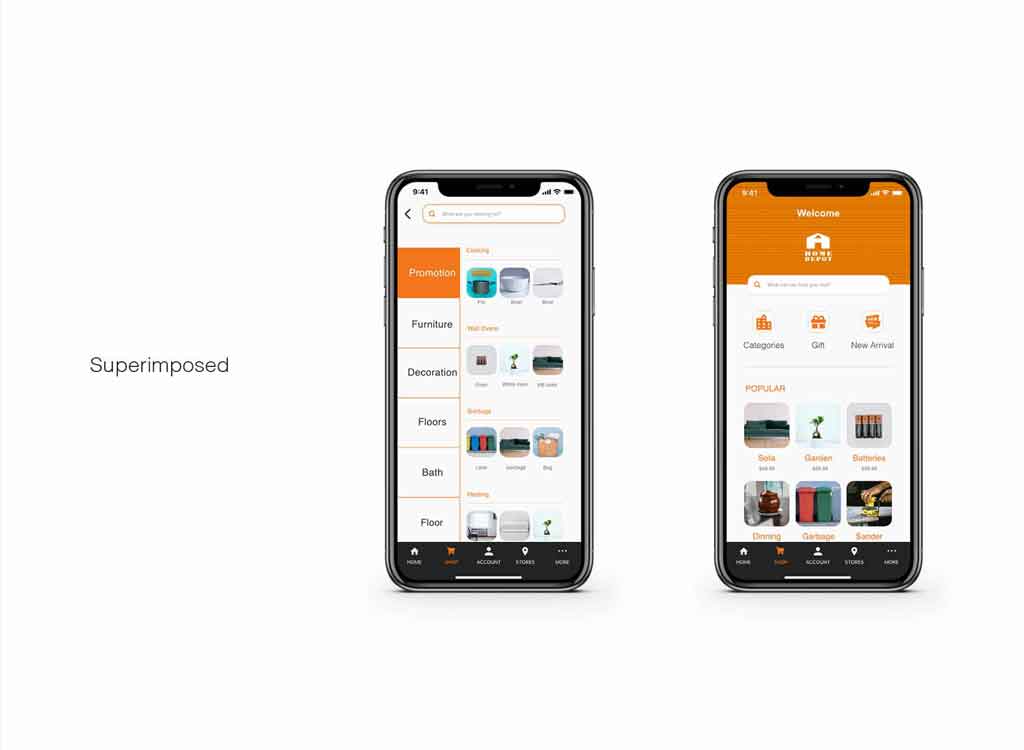
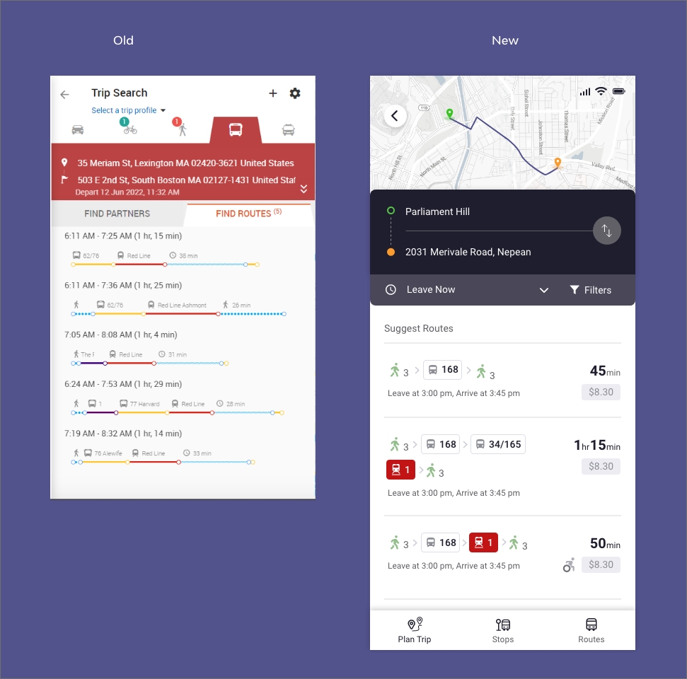
Compare - Preview Browse and preview at the same time
The new version UX/UI has improved, and also based on the user research insights, added some new features to meet the users needs.
STEP - 1 User Research
Talking to the users, understading needs:
Unfortunately, the initial design didn’t not have any analytics data, and due to the lime and budget limited, we were not able to get a chance to conduct a real user interview. The only thing was access is the target users’s gender, group of type, context of the project, and a existing product design with some main features.
Thus, we commenced by interview with friends and co-workers first, also, created a test plan of survey to gain insights from current customers. According to hypothesis, people who usually take public transportation would consider the sustainability, so we also prepared additional sustainable questions, shared it in the interview to help us better know them.
Fortunately, even though I didn’t get a chance to reach out to our current users, two of my friends and two of my colleagues would love to help me done interview.
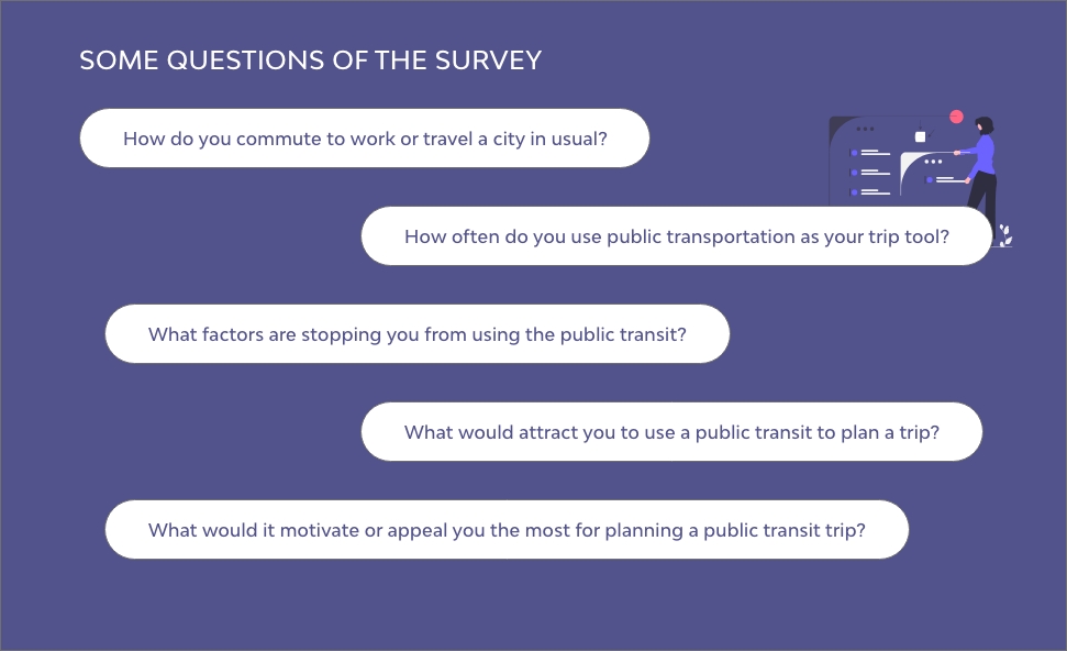
Target Users: People aging 18–50 years old and use transit public for scheduling their commute route.
What We Found?:
— How do you travel a city in usual?
Half time drive a car 50%, half time use public transit 40%
— How often do you use public transportation as your trip tool?
2-5 times per week 50%, every day for commute to work 40%.
— What factors are stopping you from using the public transit?
Uncertainty of how far along am I. Waiting a bus is tough, especially in winter when transfer buses. Parking spot is not easy to find.
— What would attract you to use a public transit to plan a trip?
Competitive price 20%, steady trip route options 40%, nearby stops checkable 30%, and whether bus stops have a parking spot, transfer stop have a heater or other facilities.
— What would it motivate the most for your plan a public transit trip?
Save time 30%, flexibility and accuracy 30%, sustainability 10%
STEP - 2 User Persona
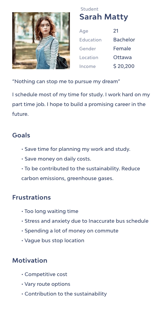
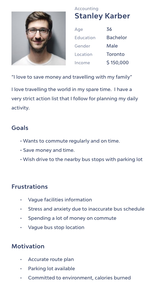
Two types of persona I created for this project. One represents students, another represents organization worker.
STEP - 3 Existing Design Test
Also, we got a usability test of the old version, in order to understand the current key problems, we had 3 developer co-workers to participate.
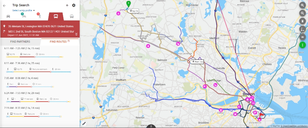
After listening to the participants. Some pain points came out, we prioritized three top frustrations:
2 participants said that it's time-consuming to figure out which route is the most best option. Including wanting to know the price, or if the bus is disabled-friendly & sustainable.
STEP - 4 How Might We
Brainstorming with stakeholders and team members started with “How Might We…” questions to help us better align user’s tasks and goals.
Brainstorming with stakeholders and team members prioritized top 5 solutions
STEP - 5 User Journey flow
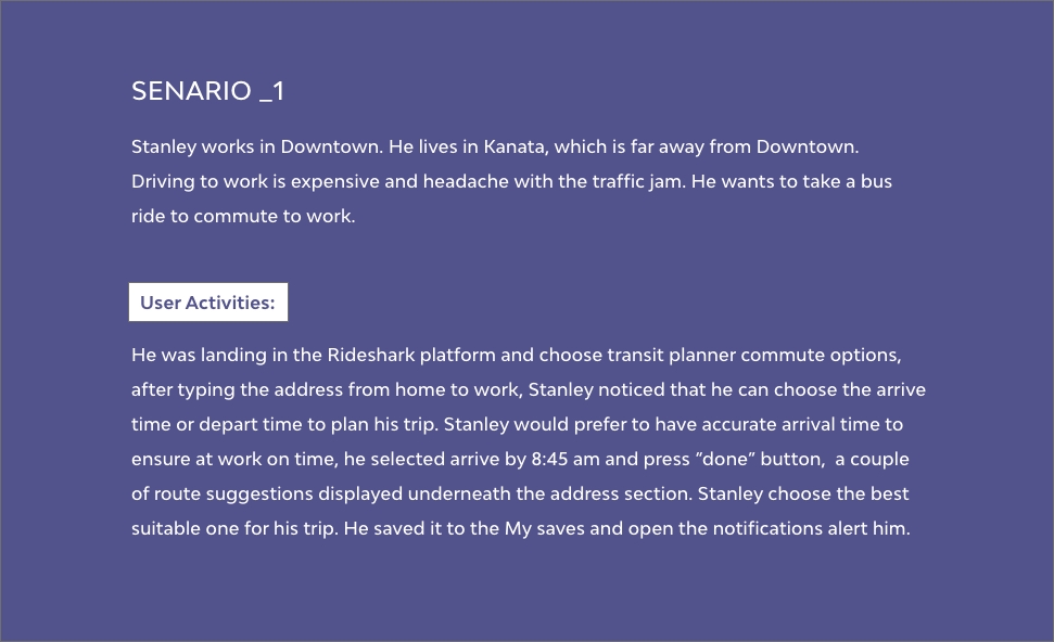
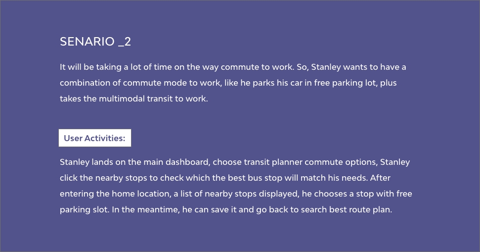
Think like a user, make sure comprehend the feel and touchpoints throughout the experience from the user’s perspective, so, create user journey story to ensure they achieve their goals smoothly.
STEP - 6 Information Architecture (IA)
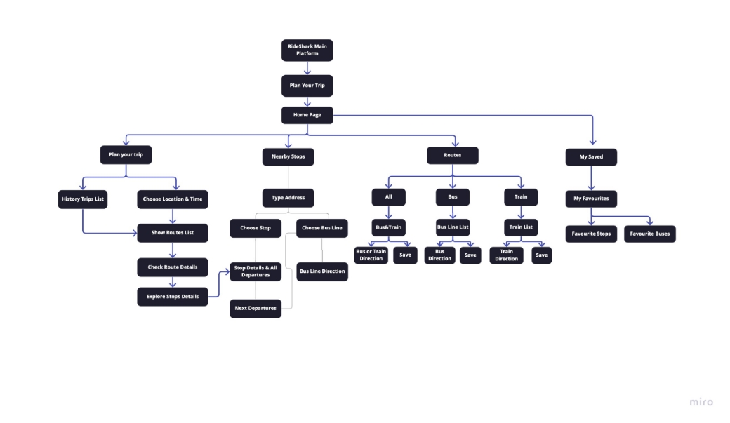
A clear organized information structure can help the user to achieve their goals without lost.
STEP - 7 Low-Fidelity Wireframing & Usability Test (iterate)
We conducted a session to test usability by interviewing 3 participants of my friends and colleagues and shed light whether we are on the right track.
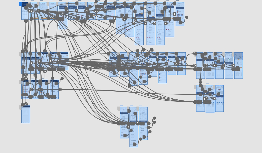
STEP - 7 High-Fidelity Wireframing
Applying the existing design system to high-fidelity user interface, the key consideration is consistency and easy to use. When encountered new UI pattern to develop, I will talk with the developer lead first and then add new UI patterns to the design system for future use.
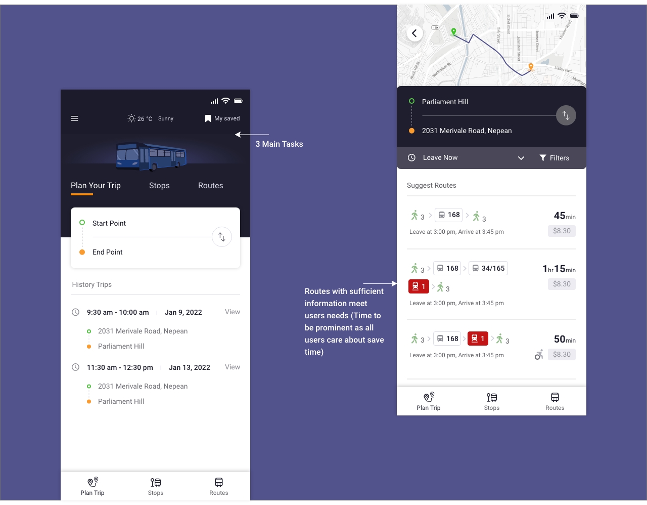
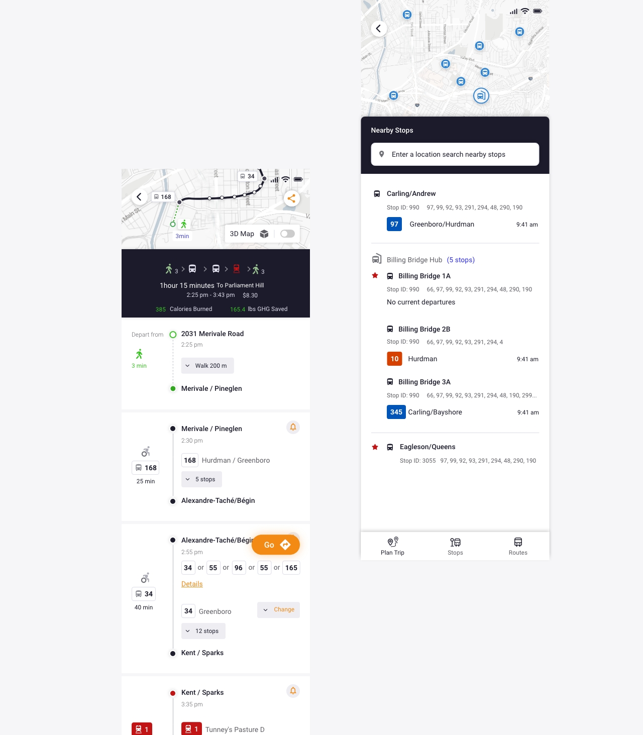
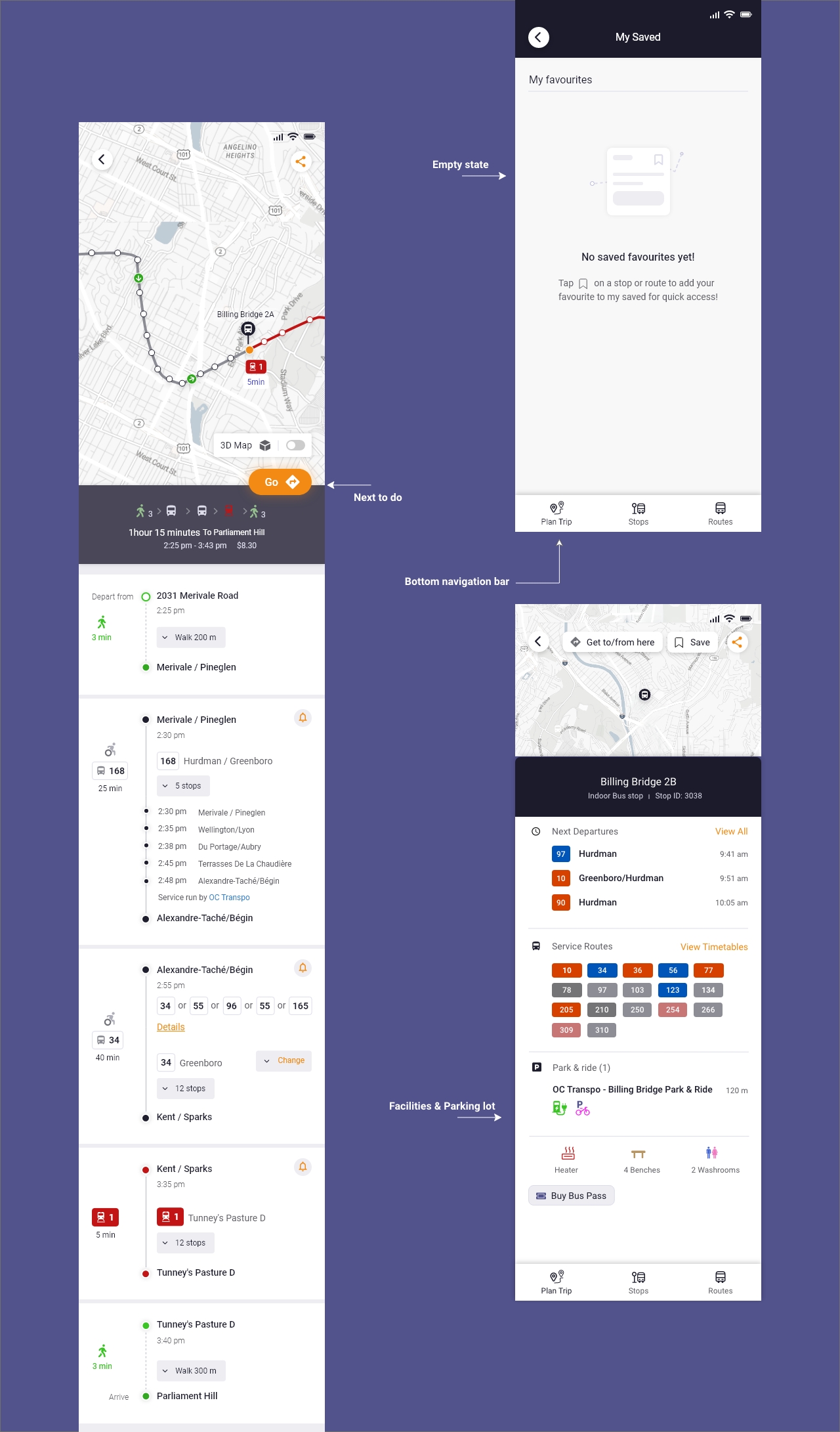
Due to non-discolusure agreements with RideShark, I am limited in showing the rest of the mockups, as they contain sensitive information.
If you’d like more about the process of design, feel free to contact me via email: yidahou@gmail.com, or phone: 614-413-8866
Challenges
The biggest challenge we faced was validating the design assumptions. As a solo designer in this project, the task of usability testing sounded daunting. I have to balance the budget, time, quality, and coding technique constraints. I’m glad my manager and team member helped me overcome this.
Final Thoughts
Reflecting on the whole process, the most essential piece that we agreed to solve was the bus stops and bus line information, which we decided on recruit real customer to conduct interview in the next round of design to get more valuable feedback.
Redesigning Transit Planner has been a great experience to me, I’m grateful that I got the opportunity to work on the whole process. A big thank you to Tom, Bryan helped me a lot with patient.
