Logo Design
Competitive ProjectInspiration
My inspiration was based on a real story I'd ever heard. The story was about a student who studied hard and acquired final succeed, as well as dedicated to the society. She said all her achievements could give credit to the support of the funding.
Concept
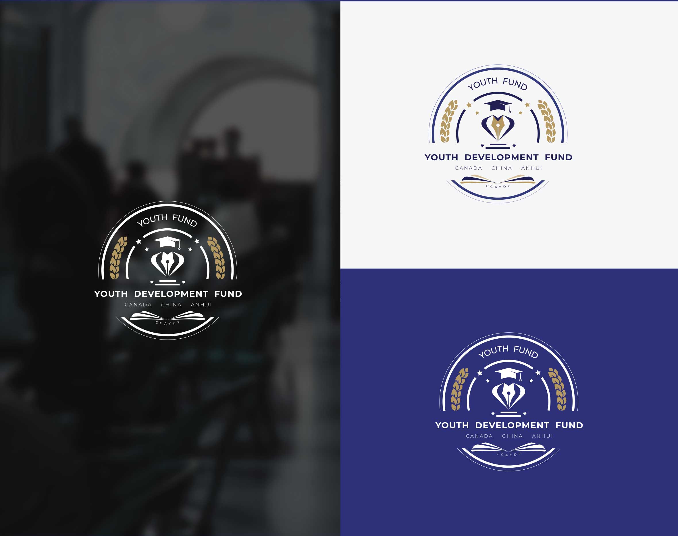
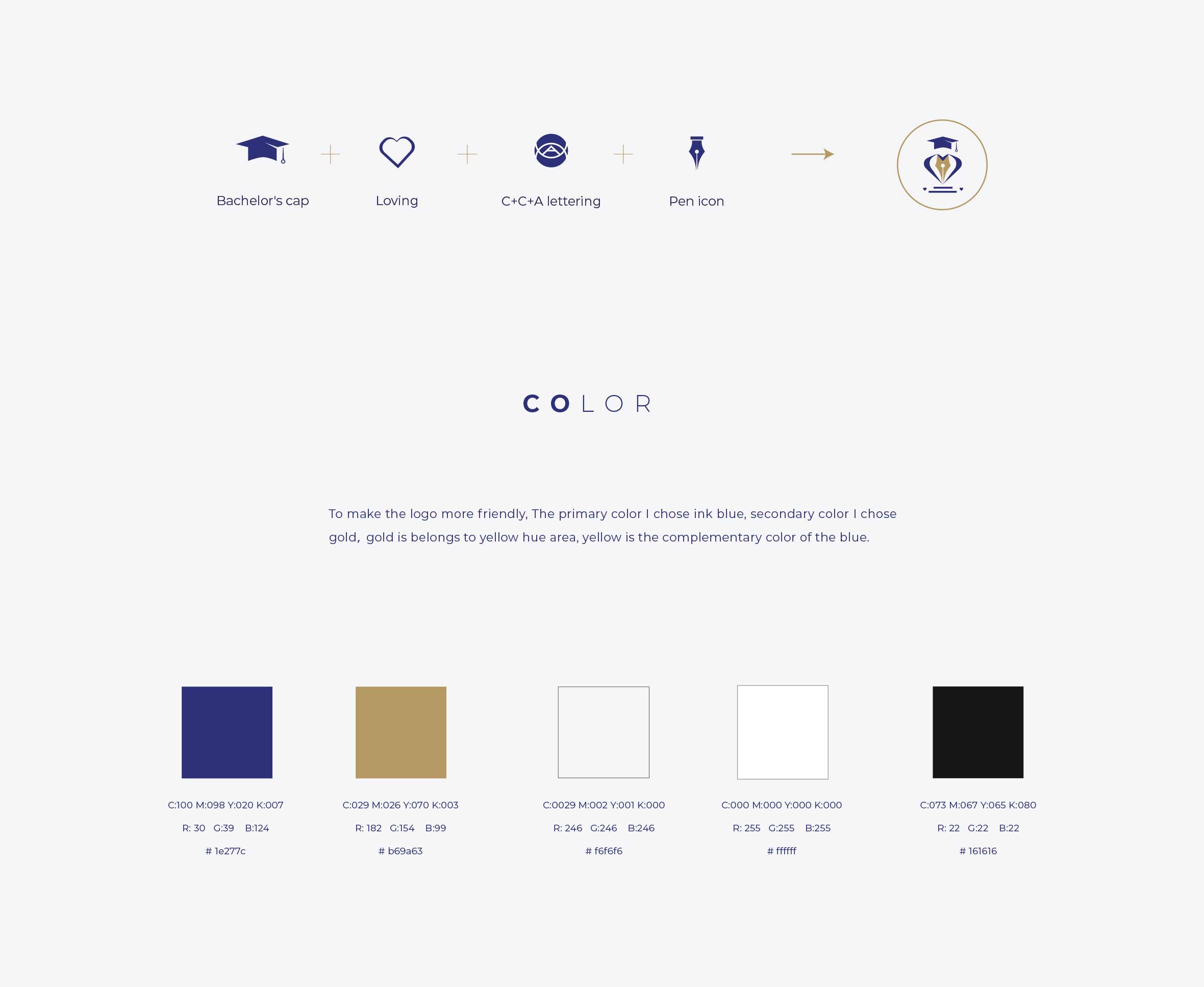
Pen, one of the most important sign in the academic field. So, I decided to use the original ink color as the primary color. Utilized a pen as the main part of the Logo. I created a love icon shaped by two hands which means the fund conveys loving and caring. The Bachelor’s cap and the book indicate this fund program target students. A nested mogogram design that combine the first letter of Canada, China and Anhui to make it more meaningful.
Delivarables
Visual Brand Identity
Years
2020
Objective
Design a logo to build a trustworthy meaningful brand image, to support and encourage students to go further, as well as contribute to the world in the future.
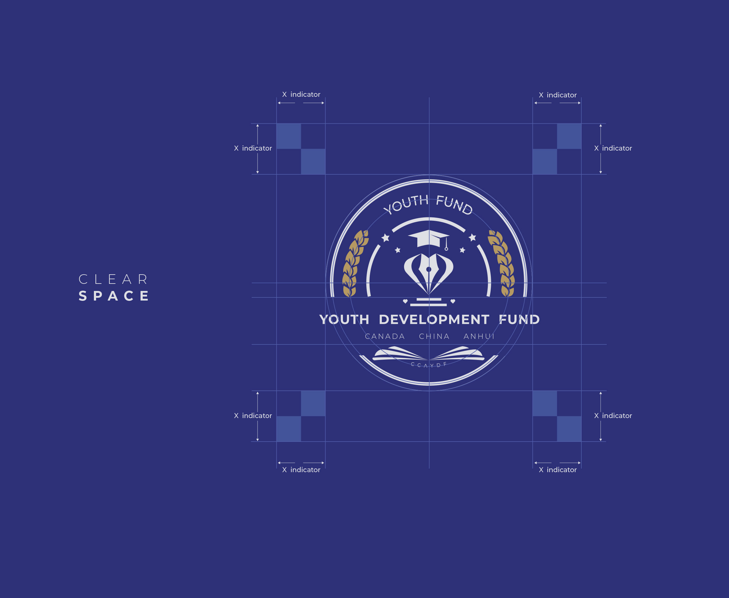
Ideation Concept & Guidelines
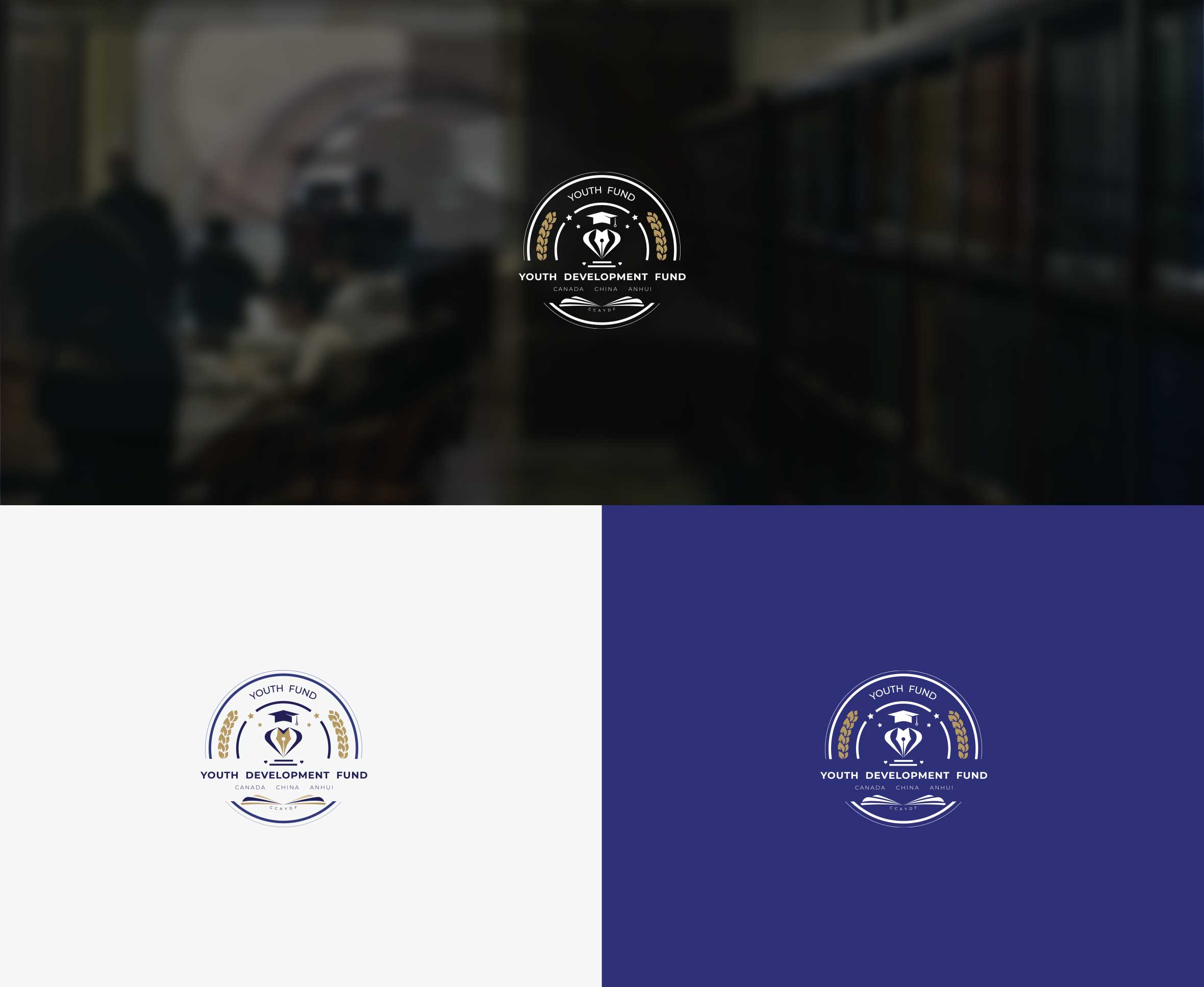
Display Logo appears in different surrendings
Aiming to acheive the marketing needs. Logo must be used as if the position given below in the mockups.

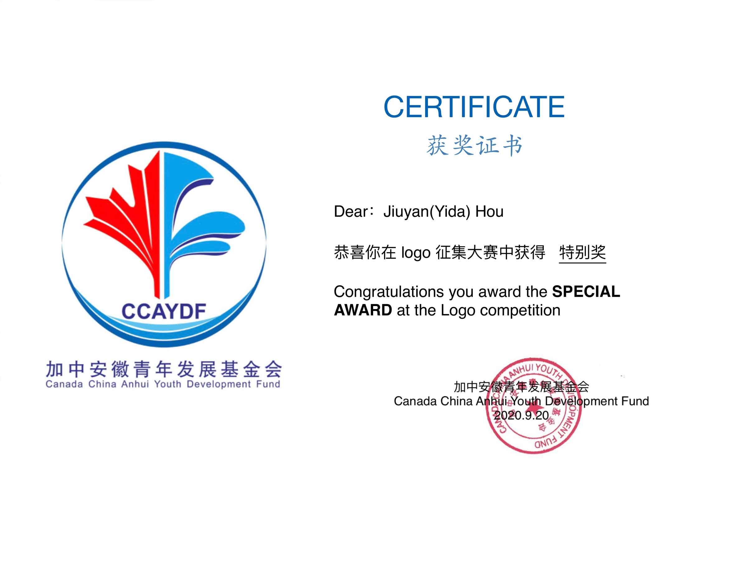
Achievement Special award
As of September 10, 2020, ten entries were voted from all the entries by the committee organization, and then, top three entries were selected by the Jury (composed of Academics, Design Professionals). My work was voted second place and won a "special award".
