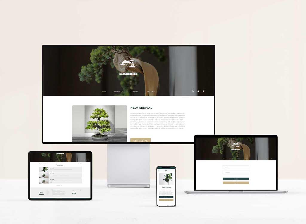
UX Case Study - Mobile App Redesign

Student Project

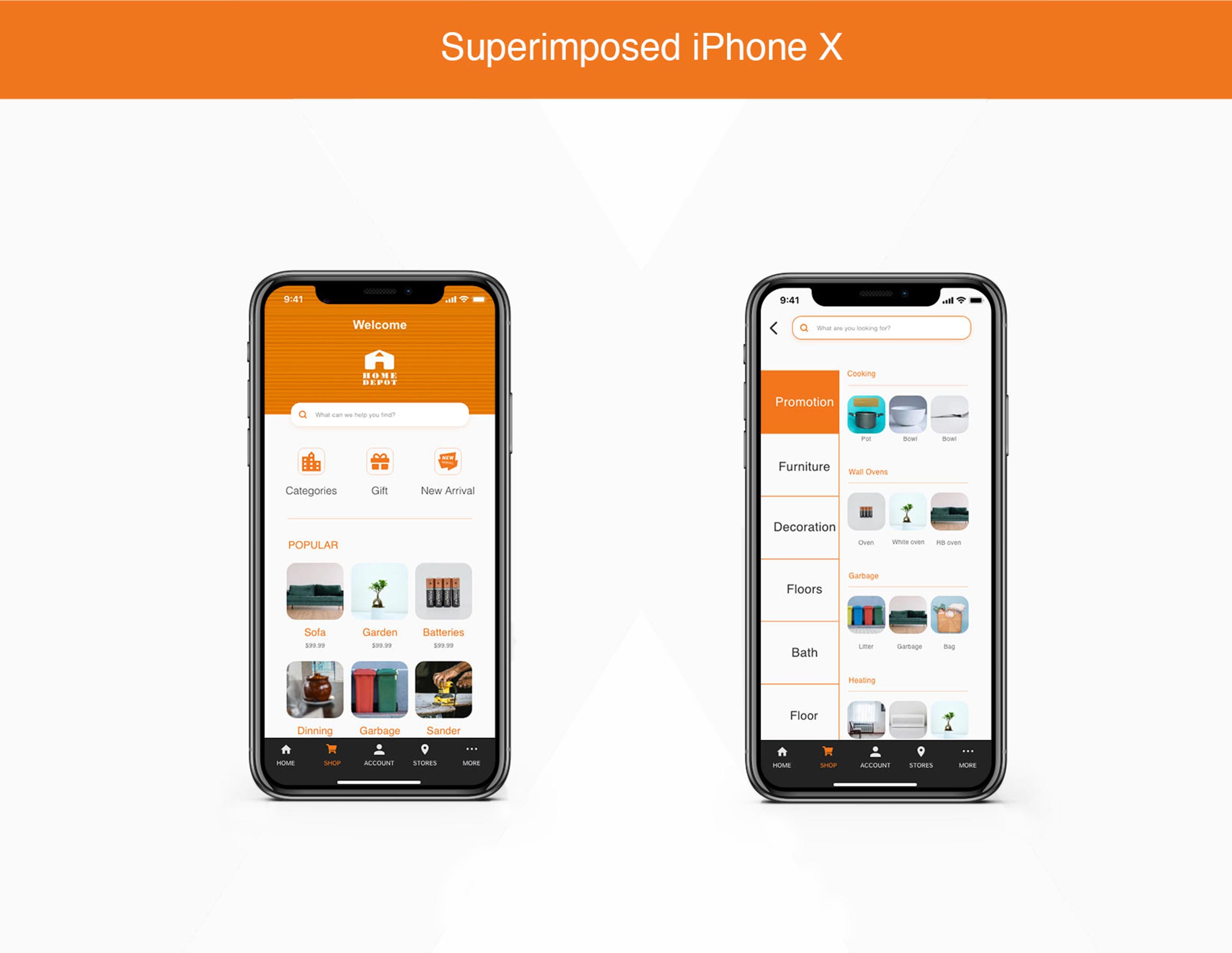
For this project, I spent 5 hours per week, which lasted three weeks. Aiming to improve the users' experience. I chose the Homedepot App, an online sales retail. Due to the time constrain, after analysed the primary problems, I chose to improve the homepage and the categories page.

Delivarables

Visual branding
UI & UX design

Years

2020

Objective

Redesign mobile App to encourage meaningful engagement, reducing the bounce rate.
homedepot-homepage

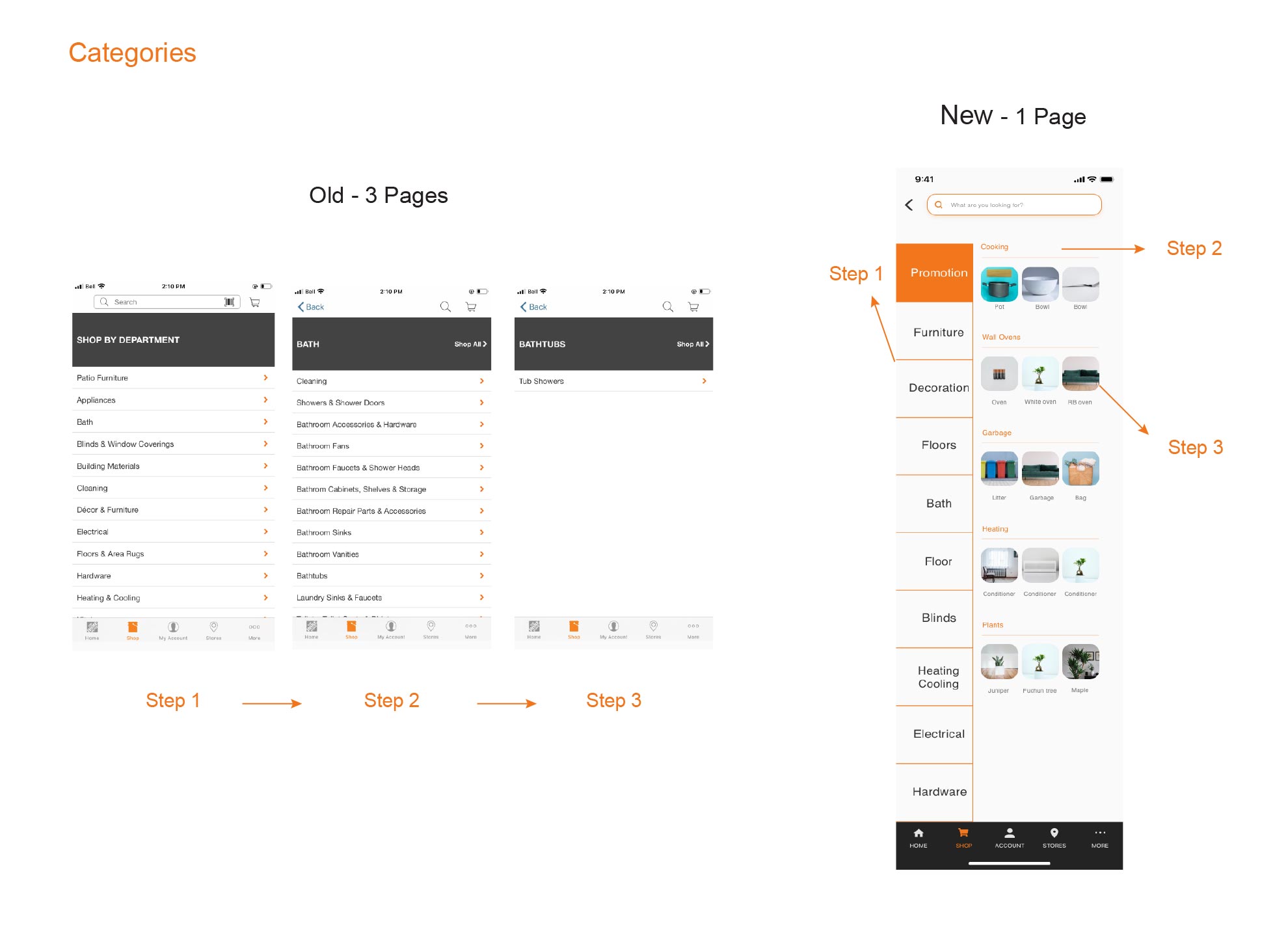
Compare - Preview Browse and preview at the same time
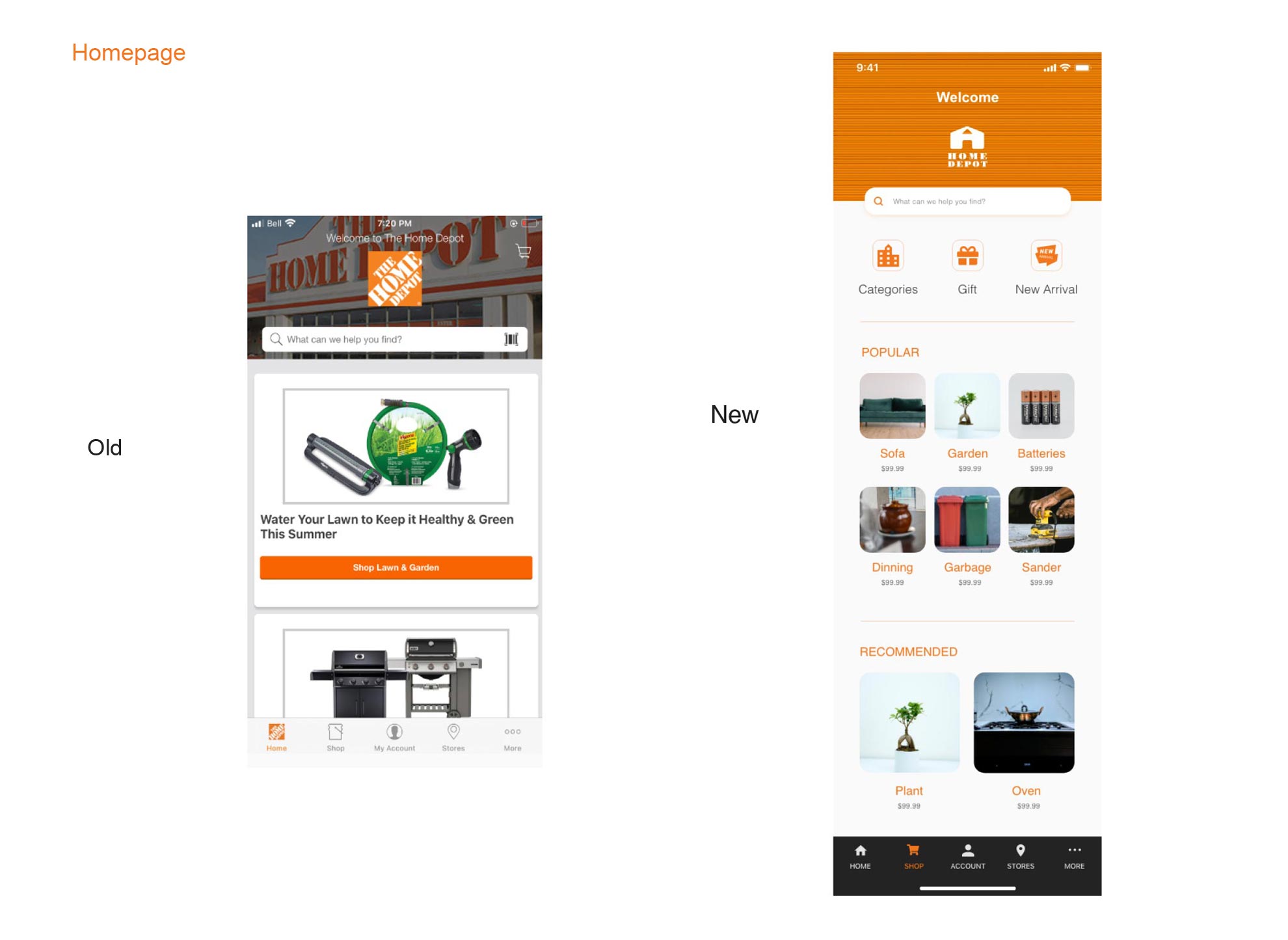
compare-homepage compare-categories

STEP - 1 Research & Define basic idea

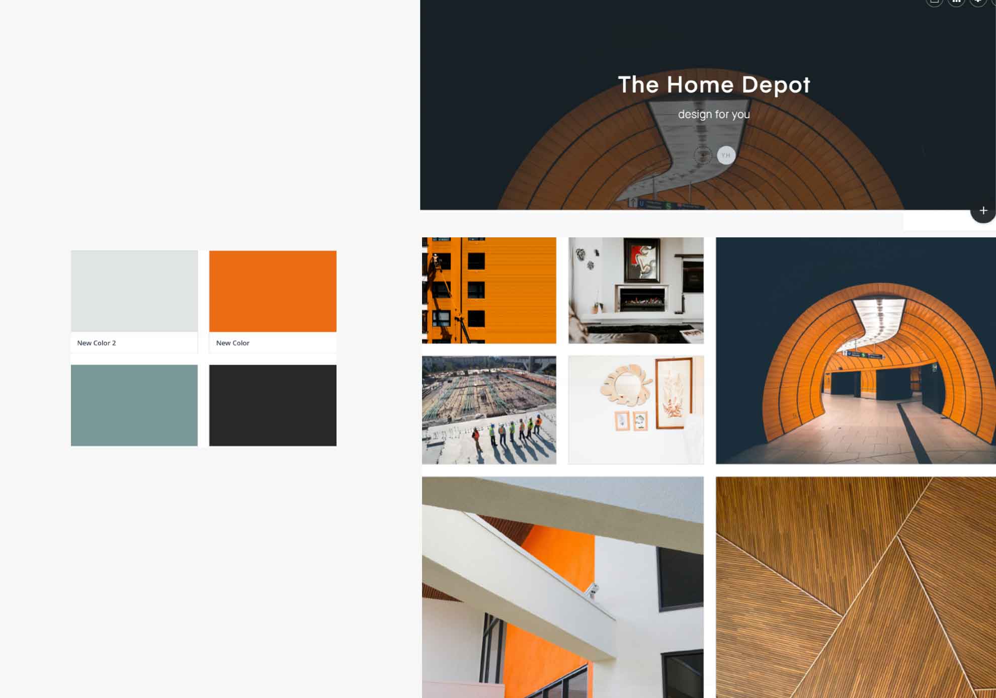
Targeted market research, analyzed the persona and collected inspiration.

Understading Problems :

I conducted research interviews with some of my friends who also often using this APP to uncover the pain points that they were experiencing. And this interview include: understanding users’ goals and needs, uncovering the pain point with the shopping journey, determining the success of the tasks measured.
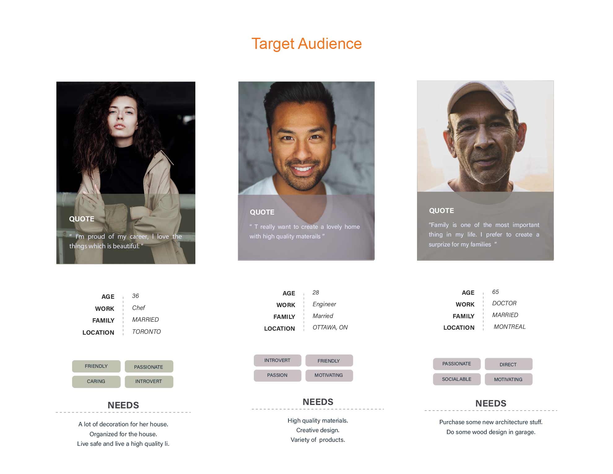
handraw-prototype moodboard


After listening to the participants, I prioritized the top frustrations:

  • Confused about where they could go.The participants expected to get more information in as intuitive way as possible. The users arrived in home page, confused about where does the filter lie on.
  • Catogeries pages, it's way too complicated that lead two-thirds of participants to get lost. The users wanted to find the products faster. Browsing the screen longtime would lead the eyes to get tired. So, everyone wants to get the thing as fast and simple as possible.
  • STEP - 2 Ideation & Prototype

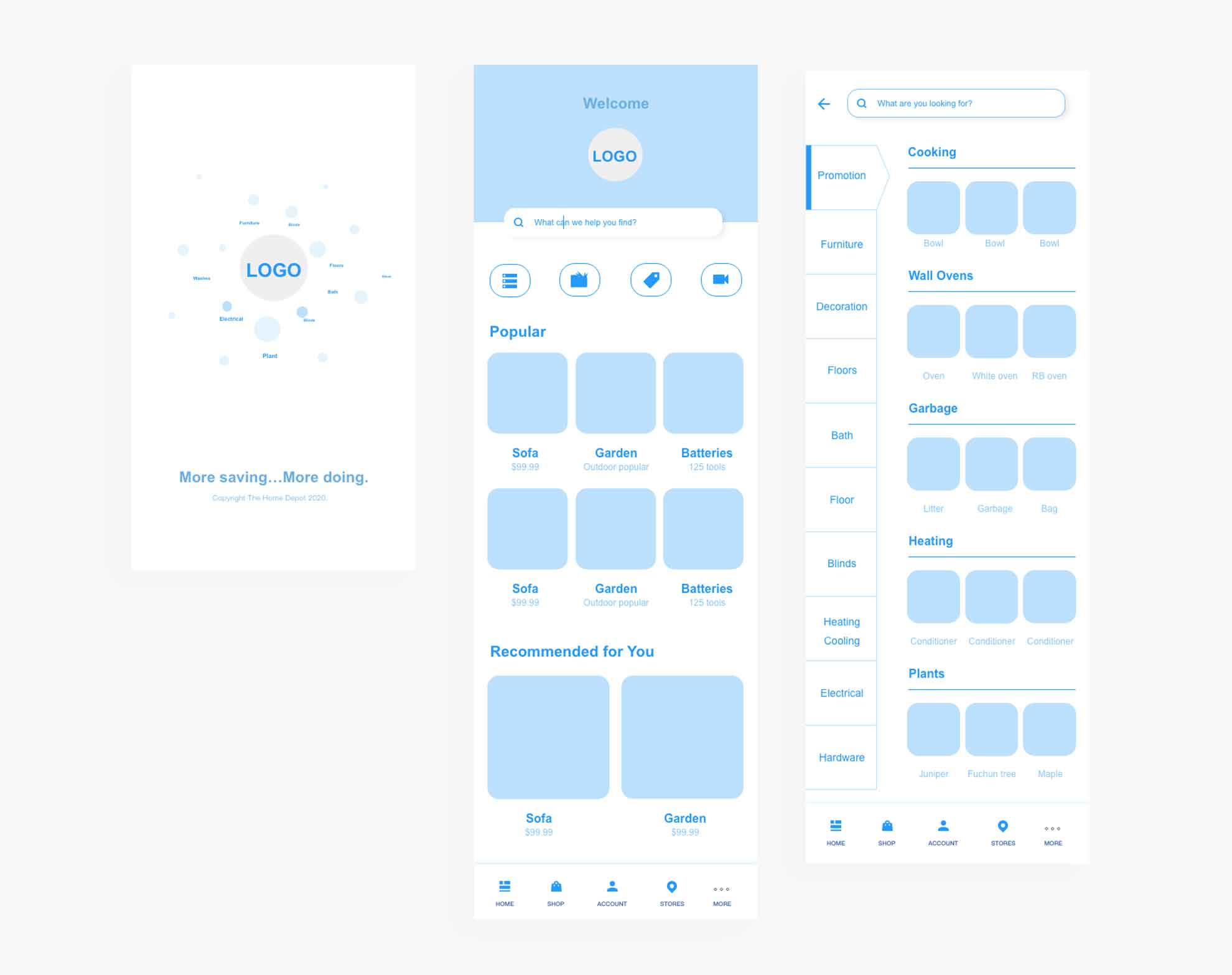
    After analyzed the problems, I added the following key features:
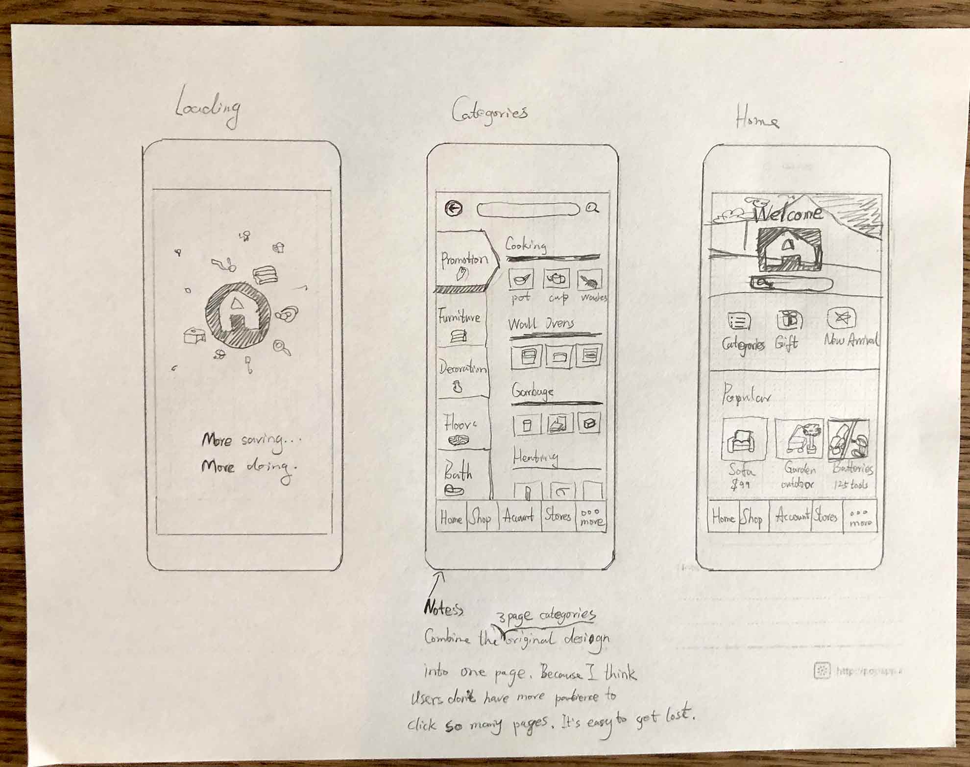
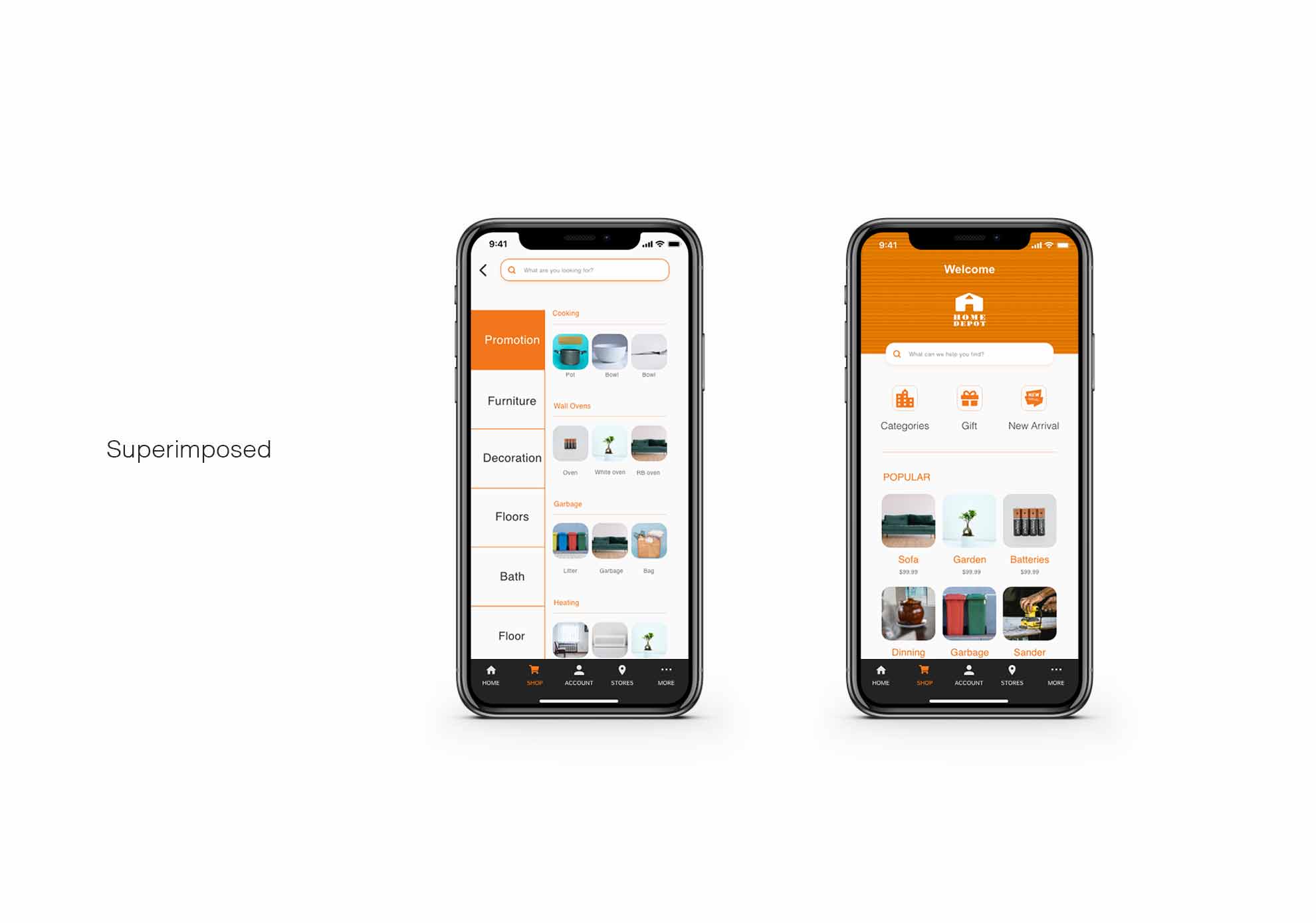
  • Give a entrance of categories in the homepage, and showcase some recommendations. Home page is very most important place where could intuitively guide users. In case the users run away instantly, it's engagement to add entrance of categories for specific users and pick some recommendations based on the users shopping history data.
  • Sort out the categories friendly. After the users clicked the entrance of categories, how to guide them have come to become important. So, on mobile app, to collape the categories and the subcategories into one page to increase the space vertically instead of horizatally looks more friendly for user browsing.

  • handraw-prototype digital-low-fidelity

    STEP - 3 Visualized

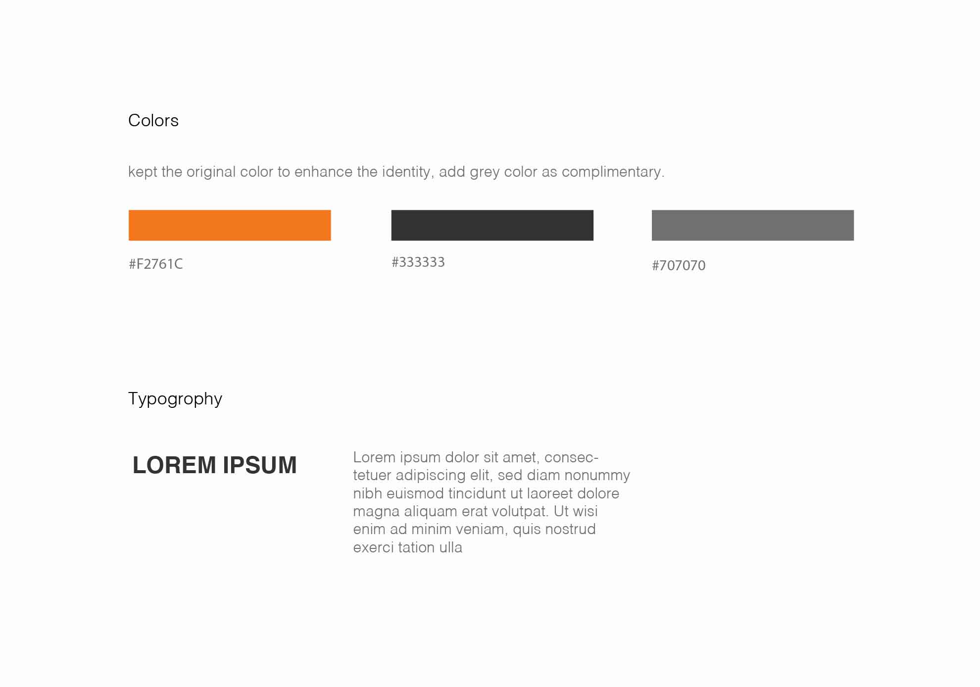
    Defined visual rules to limite clutter, crafted all pages with consistency style assets.
    assets
    assets

    Other projects