UX Case Study - Bonsai Website Redesign

Student Project

For this case study, I spent 5 hours per week, which lasted five weeks. Aiming to improve the users' experience. I chose a website called BonsaiDirect, BonsaiDirect is an e-commerce website. Due to the time constrain, and the participants top frustrations, I decided to redesign the visual part and the process of checkout journey.

Delivarables

Visual branding
UI & UX design

Years

2020

Objective

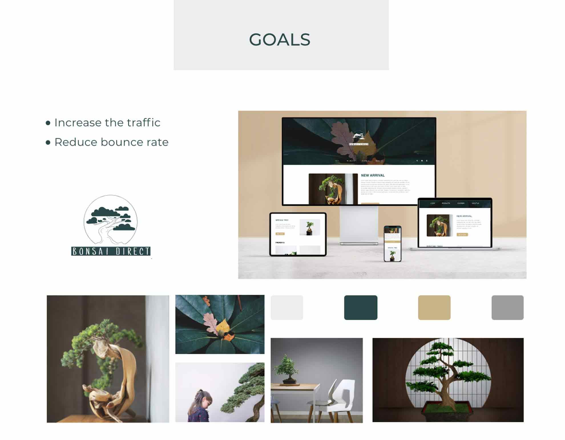
Redesign website to encourage meaningful engagement, reducing the bounce rate.
bonsai-homepage

Compare - Preview Browse and preview at the same time

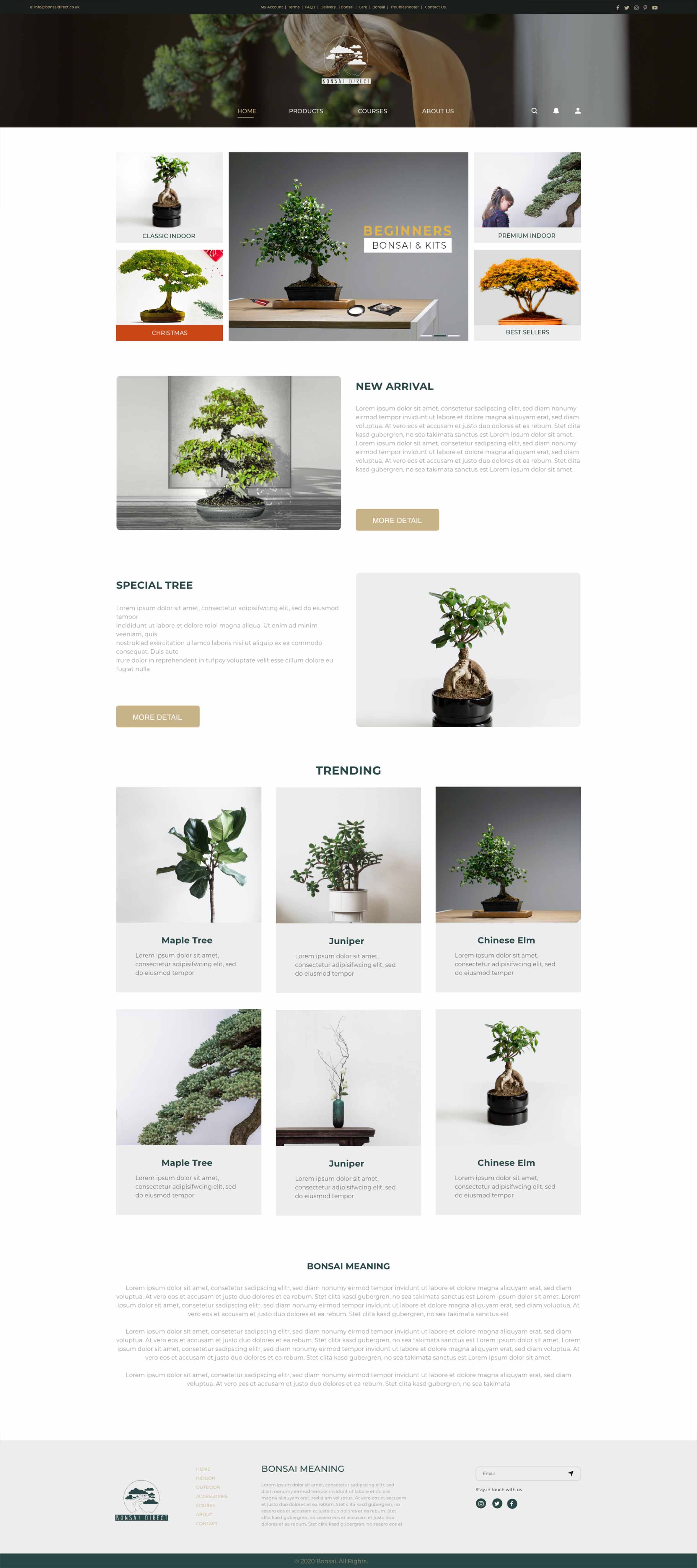
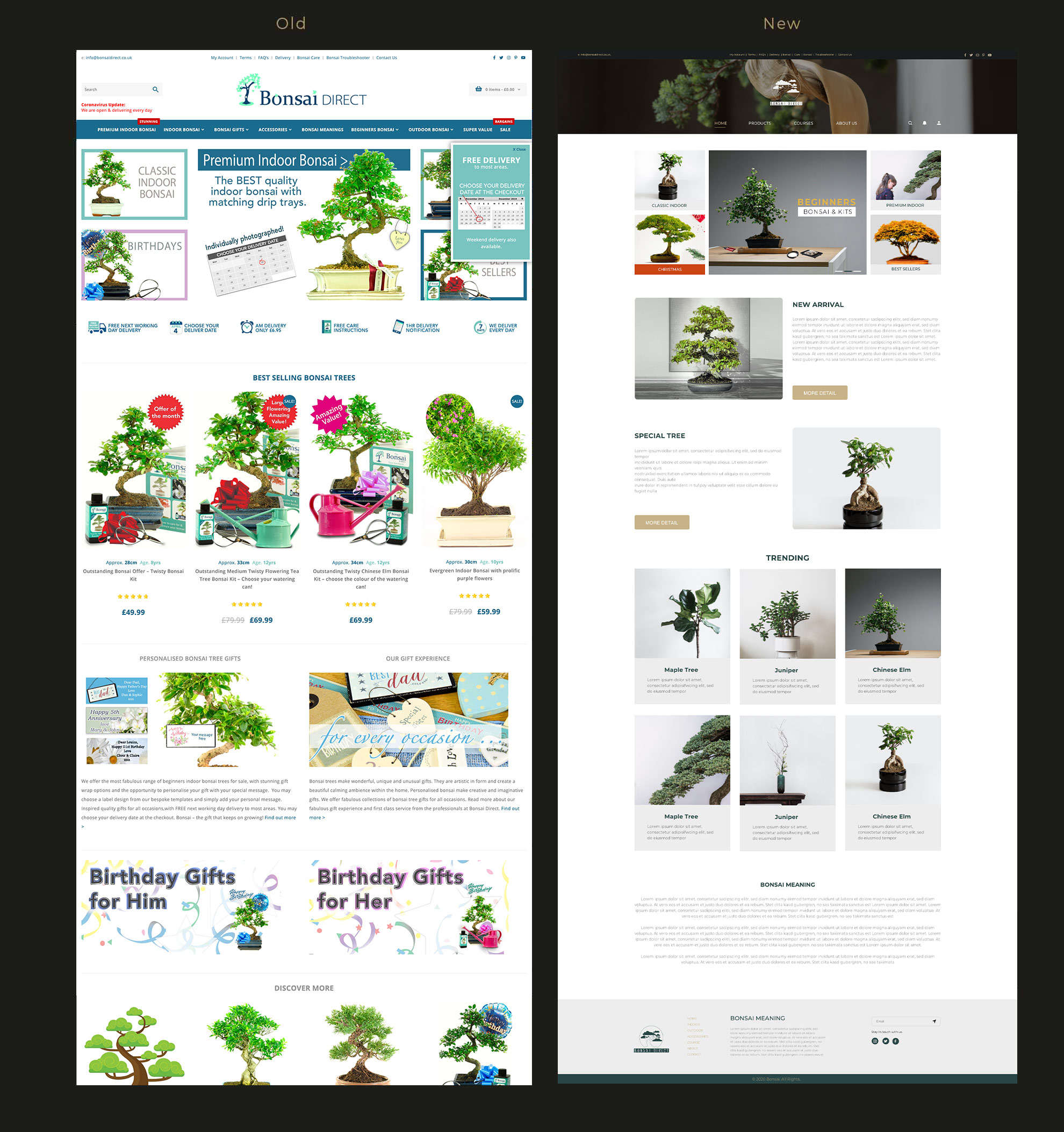
The old page has massive cluttered images that are full of distractions, which lead to meaningful engagement was very low. Other than that, the navigation bar has some needless duplication. The new page solved the pain point of the users.
bonsai-original-homepage

STEP - 1 Research & Define basic idea

Understading Problems :

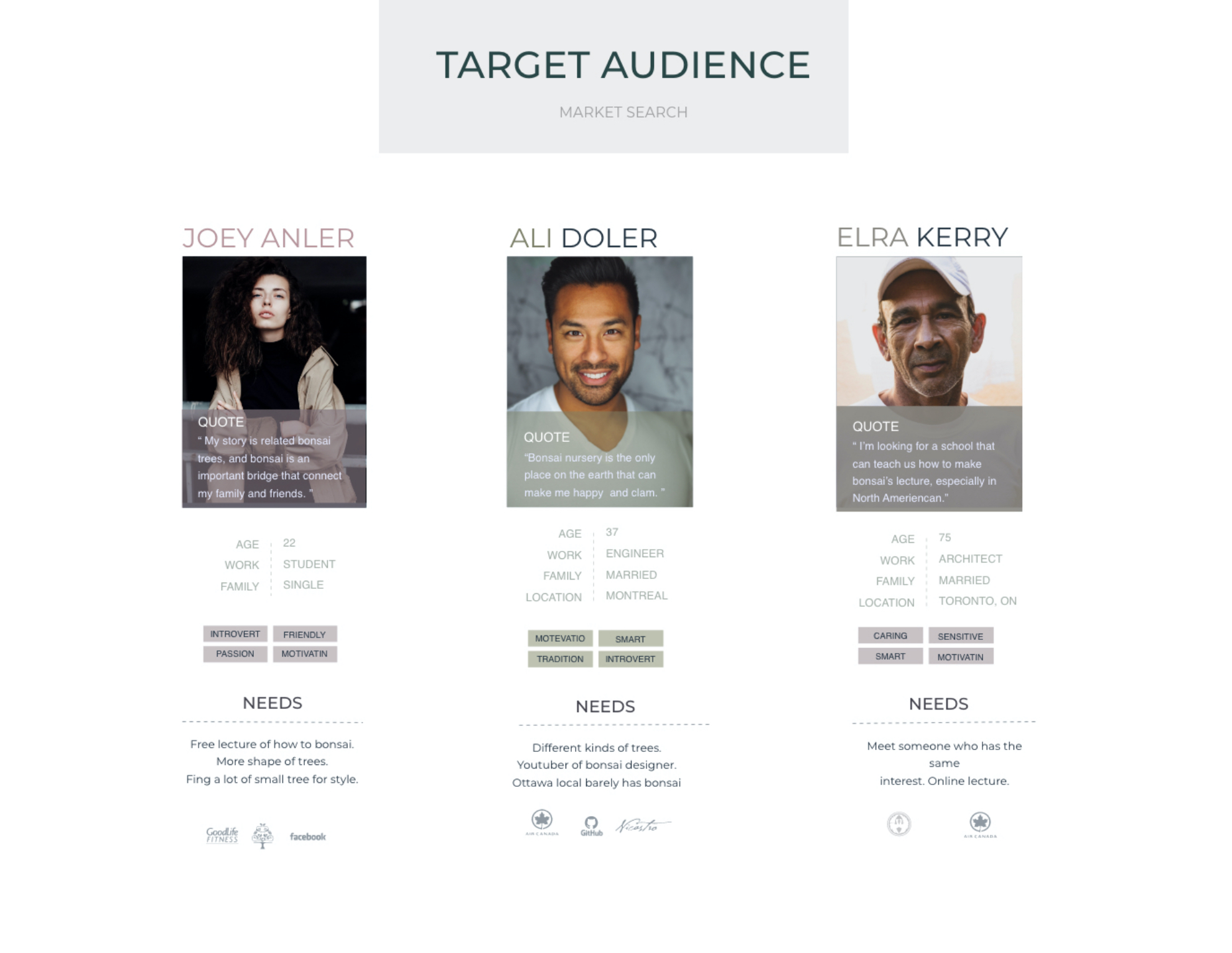
To improve the users' experience, solve the problems. I need to figure out where the problems lie, then how to solve them. As a fan of bonsai, I understood the pain points of shopping experience. Wanting to validate the pain points with others, so I asked 9 random friends and classmates to walk them through this original website and try to find the pain points they might have.
bonsai-design
bonsai-design bonsai-design


After listening to the participants, I prioritized three top frustrations:

  • First impression matters Some participants said the cluttered layout and the low-quality images cause the first impression doesn't match their expectation.
  • Shopping process confusion, and the guidance of the check-out journey chaos. Some participants said they sometimes want to place the order instantly, but they always have to "add to basket" first. The biggest problem is the check-out filling information page, which placed massive information that needs the users to fill it out, and massive information will cause users want to reject subconsciously, which would be increasing bounce rates.
  • Needs of professional planting course. Some participants said the professional planting videos were hidden deeply, it's hard to find them.
  • STEP - 2 Ideation & Prototype

    To solve those problems, I designed the following key features:
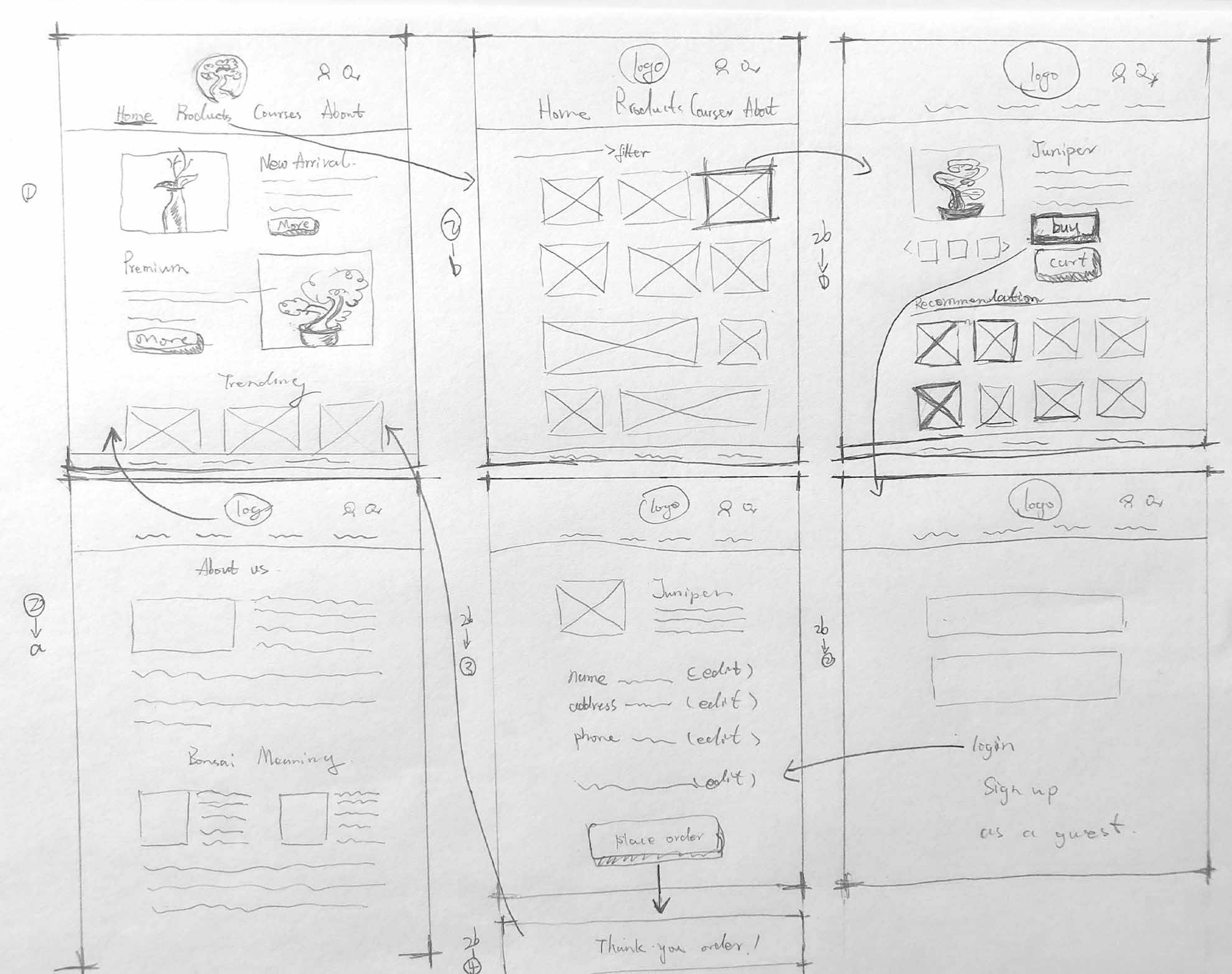
  • Reorganized the content categories. Analyzed the common pain points of the users, I reduced some repeated catogories and dragged the courses part into the navigation bar as opposed to hidden them deeply. I redesigned the whole page visually to convey a elegant modern style.
  • Added a "buy now" botton. On the product detail description page, I added a "buy now" botton above the "add to basket" to conveinient the users who wanted to buy directly, this botton could reduce a redundant step of the shopping process.
  • On the check-out filling information page, breaking the information down into four steps instead of one-page forms stacked. We can imagine if someone guides us to do something step by step, it seems, is easier to follow than massive information appears at one time.

  • bonsai-design

    STEP - 3 Visualized

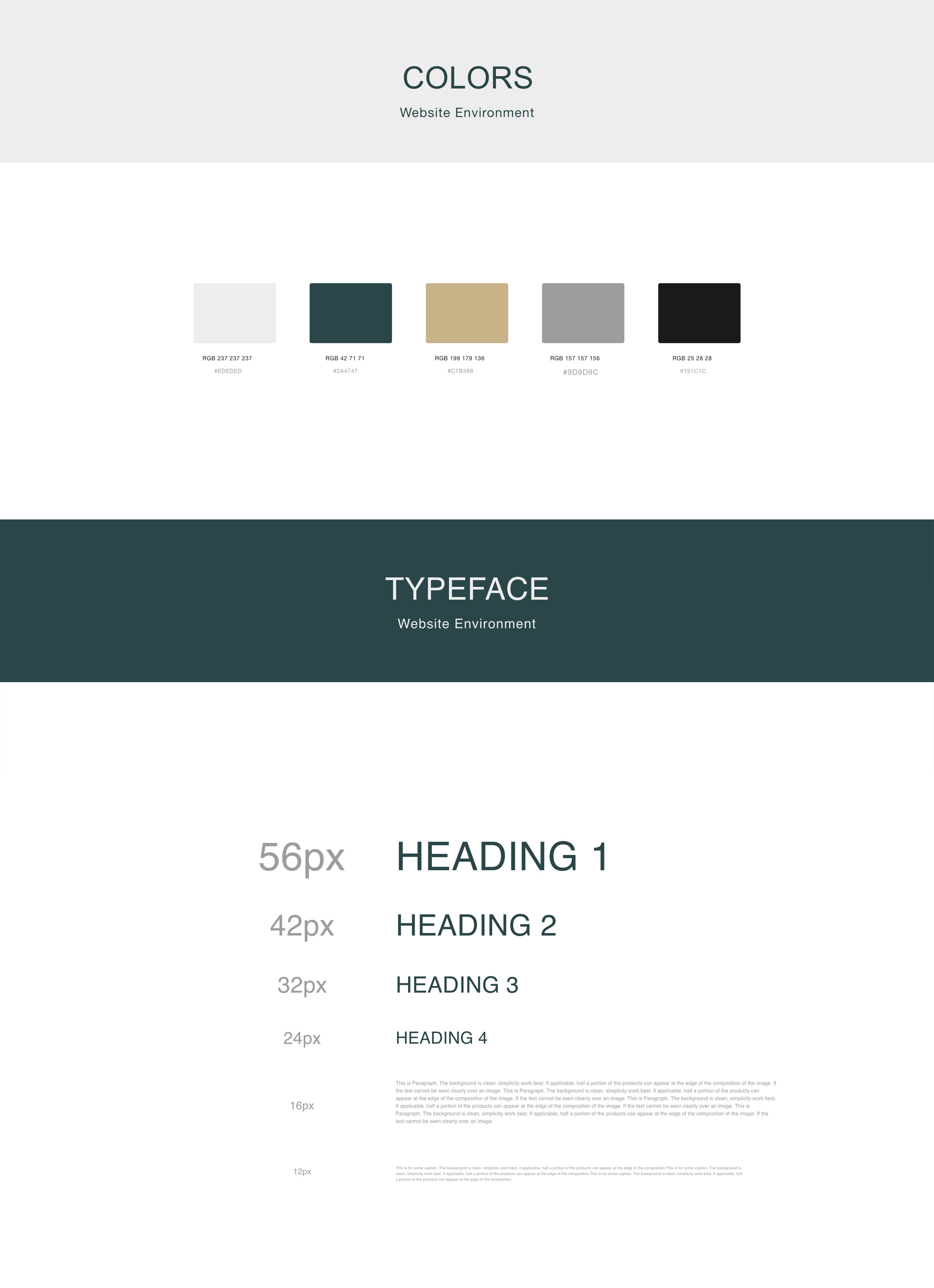
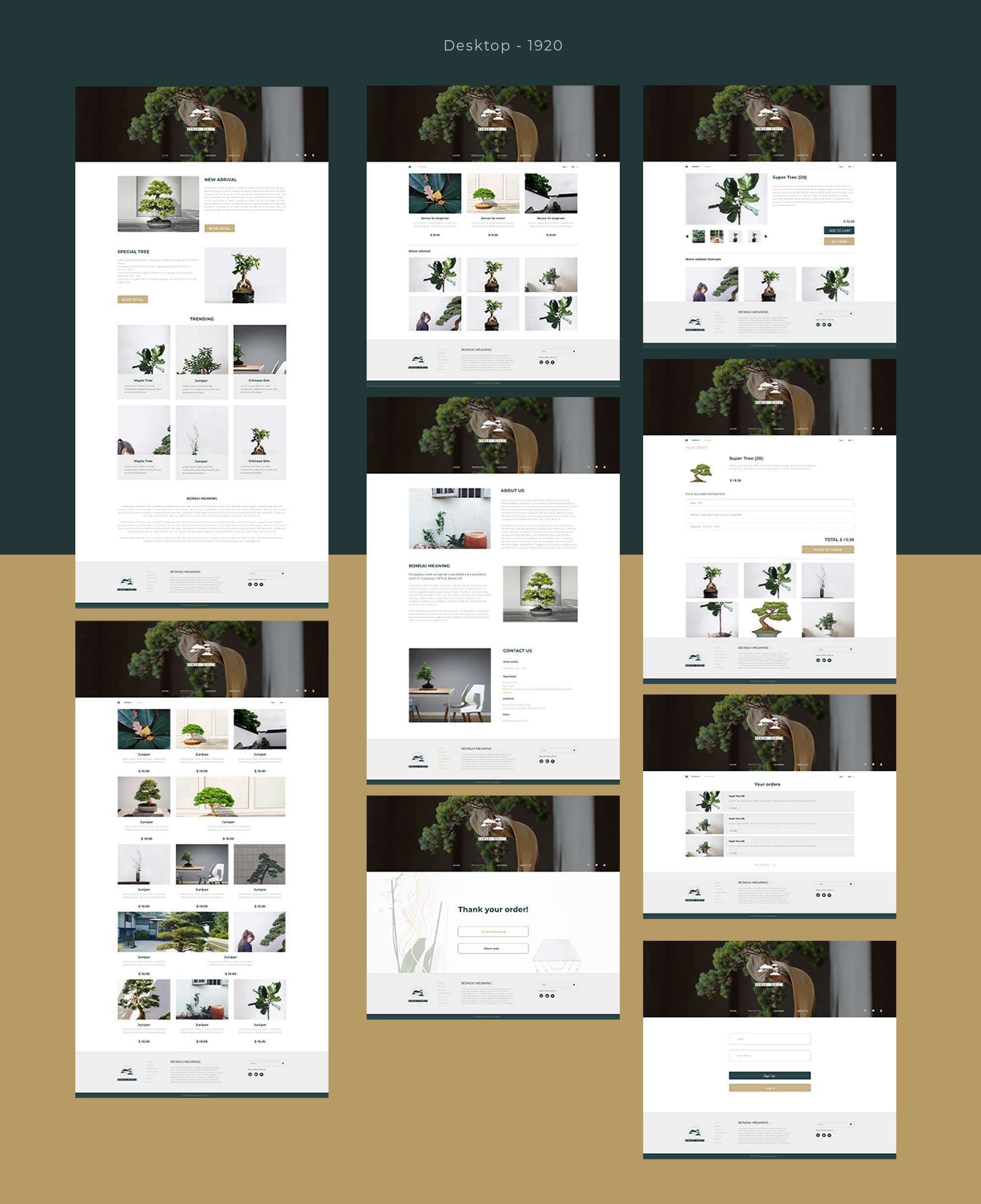
    Defined visual rules to limit cluttered layout, and fine-tuned all pages with consistency style assets.
    bonsai-design
    responsive-1920
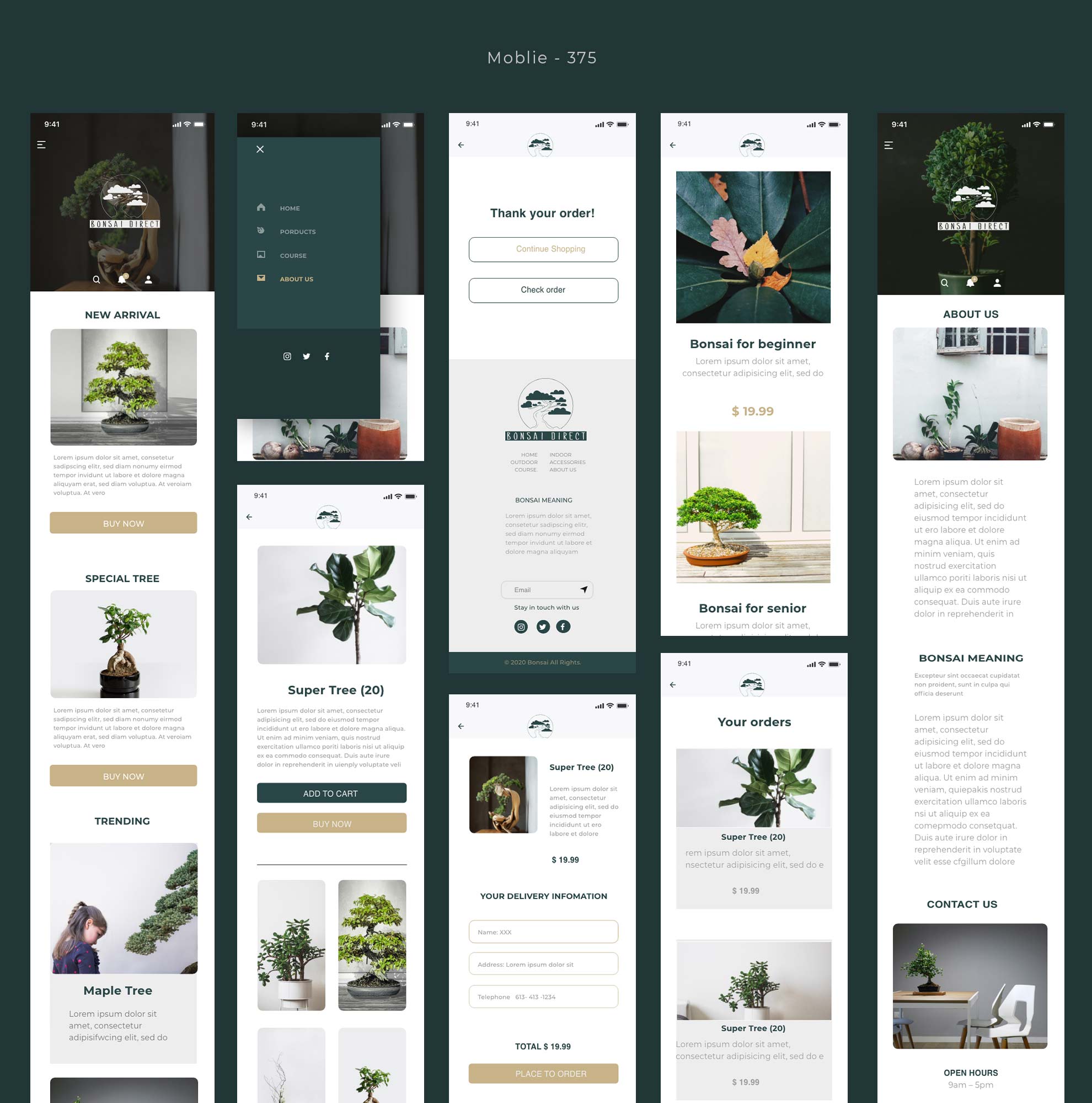
    responsive-375

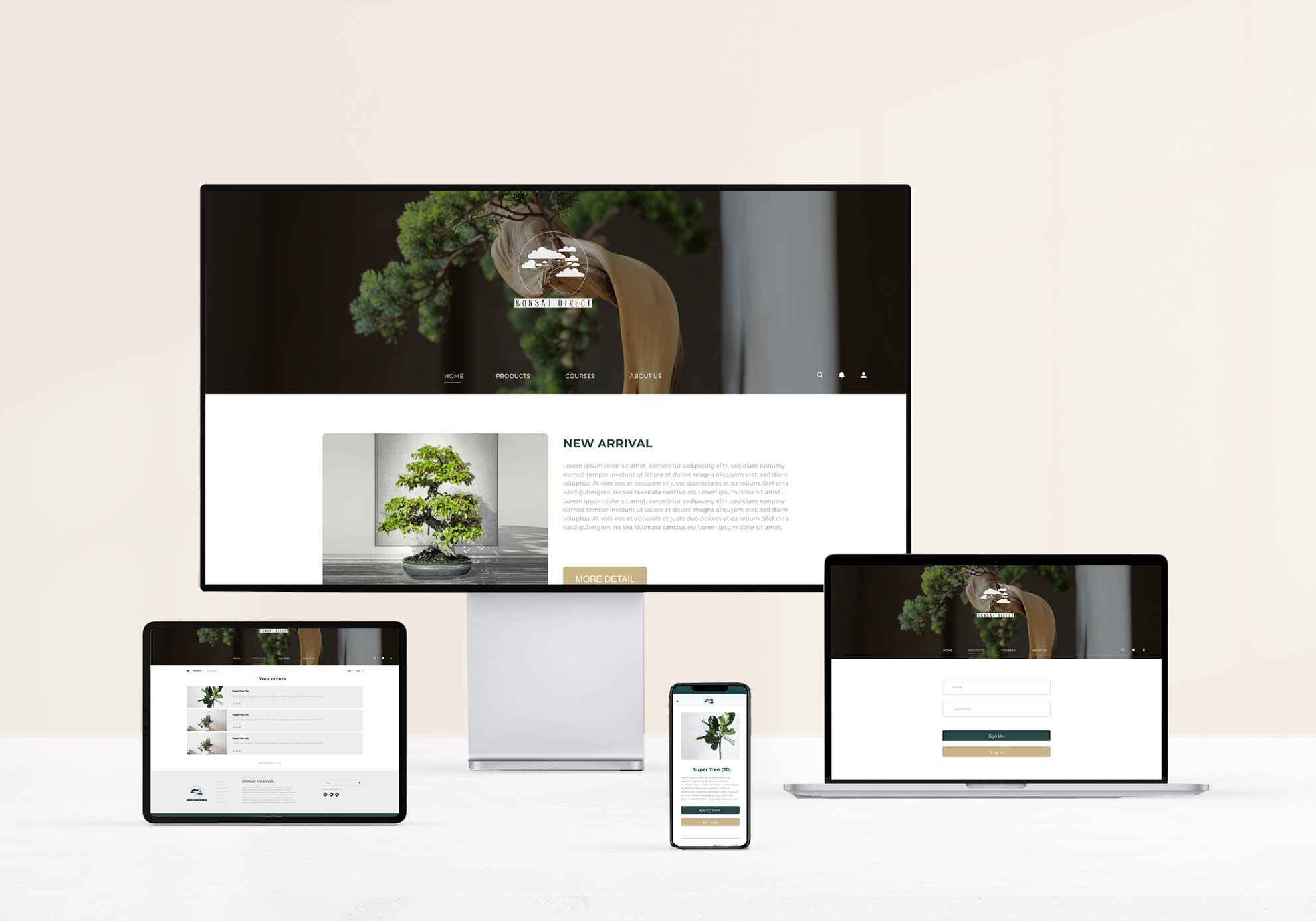
    STEP - 4 Responsive display

    Responsive design is friendly for users to have access to browsing on different devices.
    bonsai-design

    Other projects